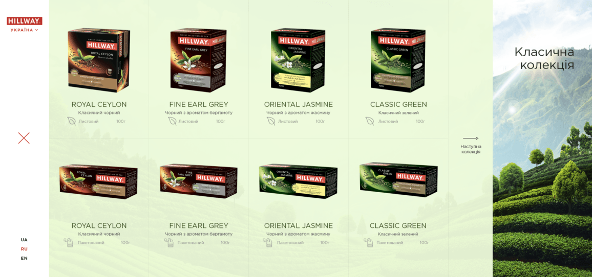
The website for a tea brand the first of all is a catalogue of the company products. The website should be good for B2C and B2B spheres. The spheres are very different with their targets. Thats why the design for new website should be simple for use, contain all information about company and product and also the website should evoke emotions.
Soft colors, unique interface animations and big beautiful pictures create best interactions and give an ability for each users feel comfortable at the site. This variables create right accents and promoted the interests for the next pages.
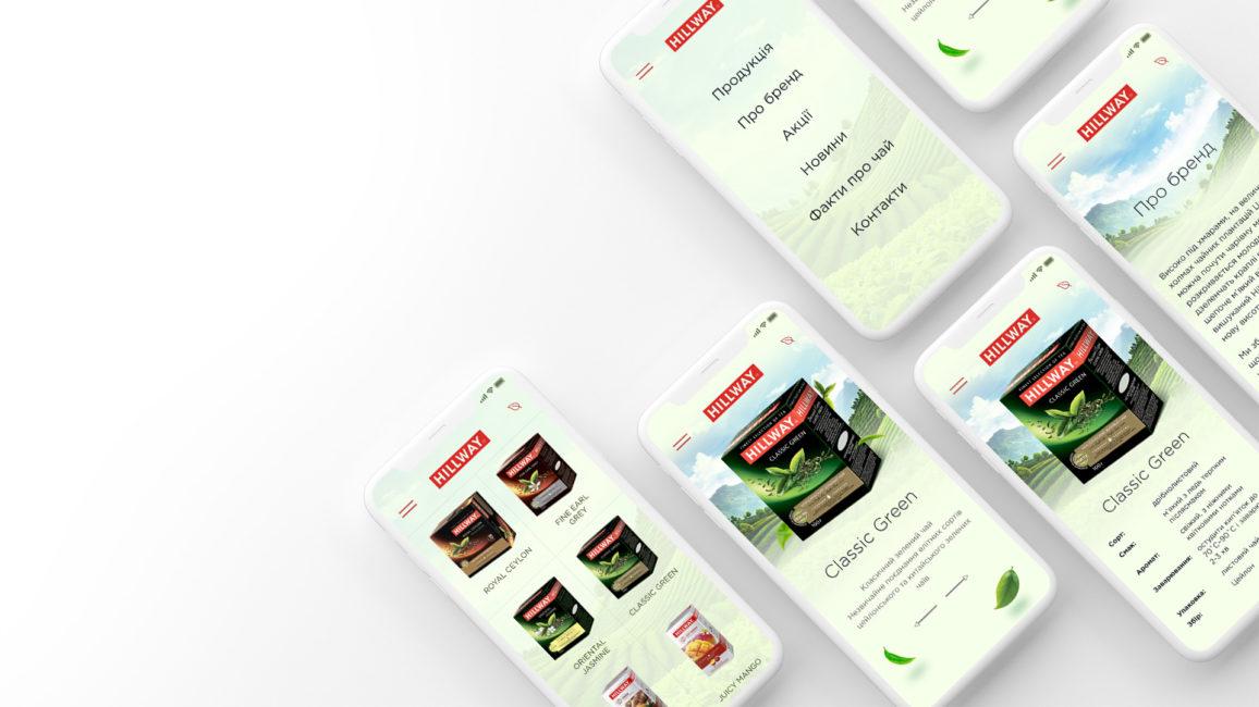
Simple design structure creates better responsive design. Because all blocks can easy adapt for any screen resolutions. And at the mobile phones all variables like colors, accents, animations are also similar as at desktop version.


