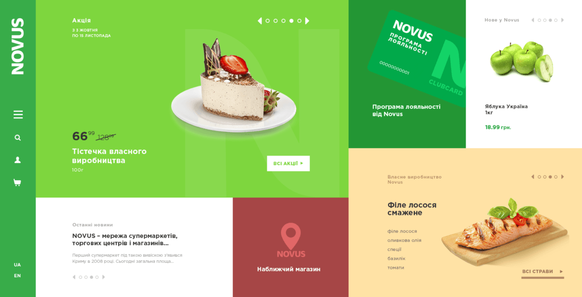
The website of retail chain is not just a site with contacts and news. This is a big platform which informs customers about all benefits and gives an ability to controll theirs loyalty plans. Problem of all similar websites is complicated navigations and information noise. Thats why users can’t get all info and they leave site with negative result.
Thats why we highlighted most important blocks for customers and created simple and unique structure.
New tiled structure gives an ability to create webdesign with visible blocks, which simplify interactions. Good contrast between blocks wich is complimented by interface animations gives an ability for customers to find necessary blocks and info very fast.
The tiled structure is most userfriendly variant for each devices. Because each blocks can adapt without lost info or visibility for any screens. Also tiled structure is most convenient variant for touch screens due to big elements and enoug free space.


